pyecharts 是一个用于生成 Echarts 图表的类库。 Echarts 是百度开源的一个数据可视化 JS 库。主要用于数据可视化。
作者:chenjiandongx
Github地址:https://github.com/chenjiandongx
一、安装
pyecharts 兼容 Python2 和 Python3。目前版本为 0.1.4
pip install pyecharts
二、入门
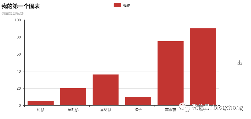
首先开始来绘制你的第一个图表
frompyecharts importBarbar =Bar(“我的第一个图表”, “这里是副标题”)bar.add(“服装”, [“衬衫”, “羊毛衫”, “雪纺衫”, “裤子”, “高跟鞋”, “袜子”], [5, 20, 36, 10, 75, 90])bar.show_config()bar.render()
Tip:可以按右边的下载按钮将图片下载到本地
-
add()
主要方法,用于添加图表的数据和设置各种配置项
-
show_config()
打印输出图表的所有配置项
-
render()
默认将会在根目录下生成一个 render.html 的文件,支持 path 参数,设置文件保存位置,如 render(r"e:my_first_chart.html"),文件用浏览器打开。
默认的编码类型为 UTF-8,在 Python3 中是没什么问题的,Python3 对中文的支持好很多。但是在 Python2 中,编码的处理是个很头疼的问题,暂时没能找到完美的解决方法,目前只能通过文本编辑器自己进行二次编码,我用的是 Visual Studio Code,先通过 Gbk 编码重新打开,然后再用 UTF-8 重新保存,这样用浏览器打开的话就不会出现中文乱码问题了。
基本上所有的图表类型都是这样绘制的:
- chart_name = Type() 初始化具体类型图表。
- add() 添加数据及配置项。
- render() 生成 .html 文件。
三、图表类型
因篇幅原因,这里只给出了每种图表类型的示例(代码 + 生成图表),目的是为了引起读者的兴趣。详细参数的介绍请参考项目 README.md 文档
1 Bar(柱状图/条形图)
frompyecharts importBarbar =Bar(“标记线和标记点示例”)bar.add(“商家A”, attr, v1, mark_point=[“average”])bar.add(“商家B”, attr, v2, mark_line=[“min”, “max”])bar.render()
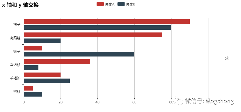
frompyecharts importBarbar =Bar(“x 轴和 y 轴交换”)bar.add(“商家A”, attr, v1)bar.add(“商家B”, attr, v2, is_convert=True)bar.render()
2 EffectScatter(带有涟漪特效动画的散点图)
frompyecharts importEffectScatterv1 =[10, 20, 30, 40, 50, 60]v2 =[25, 20, 15, 10, 60, 33]es =EffectScatter(“动态散点图示例”)es.add(“effectScatter”, v1, v2)es.render()
es =EffectScatter(“动态散点图各种图形示例”)es.add(“”, [10], [10], symbol_size=20, effect_scale=3.5, effect_period=3, symbol=“pin”)es.add(“”, [20], [20], symbol_size=12, effect_scale=4.5, effect_period=4,symbol=“rect”)es.add(“”, [30], [30], symbol_size=30, effect_scale=5.5, effect_period=5,symbol=“roundRect”)es.add(“”, [40], [40], symbol_size=10, effect_scale=6.5, effect_brushtype=‘fill’,symbol=“diamond”)es.add(“”, [50], [50], symbol_size=16, effect_scale=5.5, effect_period=3,symbol=“arrow”)es.add(“”, [60], [60], symbol_size=6, effect_scale=2.5, effect_period=3,symbol=“triangle”)es.render()

3 Funnel(漏斗图)
frompyecharts importFunnelattr =[“衬衫”, “羊毛衫”, “雪纺衫”, “裤子”, “高跟鞋”, “袜子”]value =[20, 40, 60, 80, 100, 120]funnel =Funnel(“漏斗图示例”)funnel.add(“商品”, attr, value, is_label_show=True, label_pos=“inside”, label_text_color=“#fff”)funnel.render()
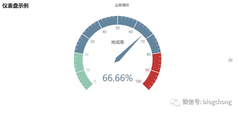
4 Gauge(仪表盘)
frompyecharts importGaugegauge =Gauge(“仪表盘示例”)gauge.add(“业务指标”, “完成率”, 66.66)gauge.show_config()gauge.render()
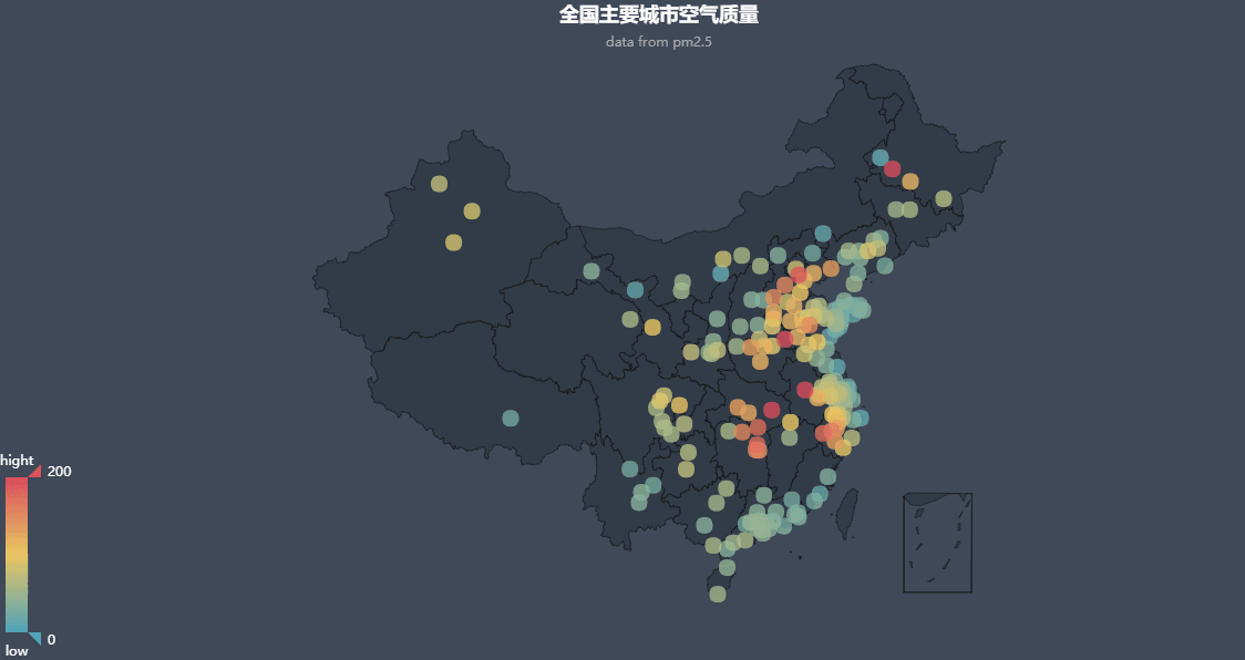
5 Geo(地理坐标系)
frompyecharts importGeodata =[ (“海门”, 9),(“鄂尔多斯”, 12),(“招远”, 12),(“舟山”, 12),(“齐齐哈尔”, 14),(“盐城”, 15), (“赤峰”, 16),(“青岛”, 18),(“乳山”, 18),(“金昌”, 19),(“泉州”, 21),(“莱西”, 21), (“日照”, 21),(“胶南”, 22),(“南通”, 23),(“拉萨”, 24),(“云浮”, 24),(“梅州”, 25)…]geo =Geo(“全国主要城市空气质量”, “data from pm2.5”, title_color=“#fff”, title_pos=“center”,width=1200, height=600, background_color=‘#404a59’)attr, value =geo.cast(data)geo.add(“”, attr, value, visual_range=[0, 200], visual_text_color=“#fff”, symbol_size=15, is_visualmap=True)geo.show_config()geo.render()
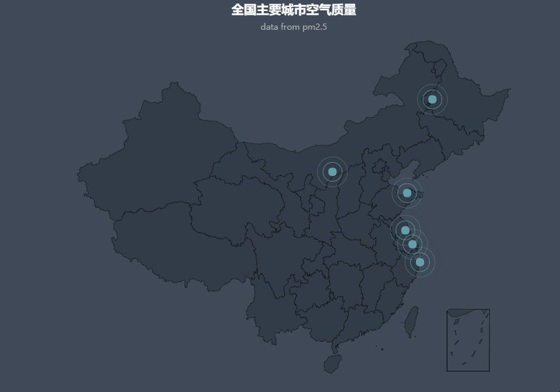
frompyecharts importGeodata =[(“海门”, 9), (“鄂尔多斯”, 12), (“招远”, 12), (“舟山”, 12), (“齐齐哈尔”, 14), (“盐城”, 15)]geo =Geo(“全国主要城市空气质量”, “data from pm2.5”, title_color=“#fff”, title_pos=“center”, width=1200, height=600, background_color=‘#404a59’)attr, value =geo.cast(data)geo.add(“”, attr, value, type=“effectScatter”, is_random=True, effect_scale=5)geo.show_config()geo.render()
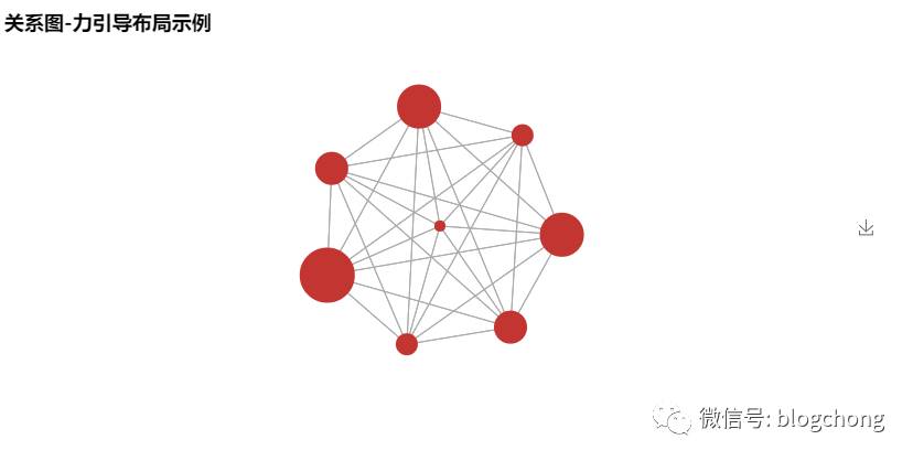
6 Graph(关系图)
frompyecharts importGraphnodes =[{“name”: “结点1”, “symbolSize”: 10}, {“name”: “结点2”, “symbolSize”: 20}, {“name”: “结点3”, “symbolSize”: 30}, {“name”: “结点4”, “symbolSize”: 40}, {“name”: “结点5”, “symbolSize”: 50}, {“name”: “结点6”, “symbolSize”: 40}, {“name”: “结点7”, “symbolSize”: 30}, {“name”: “结点8”, “symbolSize”: 20}]links =[]fori innodes: forj innodes: links.append({“source”: i.get(‘name’), “target”: j.get(‘name’)})graph =Graph(“关系图-环形布局示例”)graph.add(“”, nodes, links, is_label_show=True, repulsion=8000, layout=‘circular’, label_text_color=None)graph.show_config()graph.render()
frompyecharts importGraphimportjsonwithopen(“…jsonweibo.json”, “r”, encoding=“utf-8”) asf: j =json.load(f) nodes, links, categories, cont, mid, userl =jgraph =Graph(“微博转发关系图”, width=1200, height=600)graph.add(“”, nodes, links, categories, label_pos=“right”, repulsion=50, is_legend_show=False, line_curve=0.2, label_text_color=None)graph.show_config()graph.render()

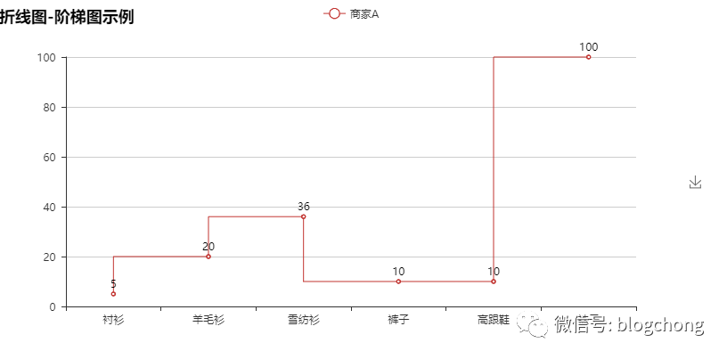
7 Line(折线/面积图)
frompyecharts importLineattr =[“衬衫”, “羊毛衫”, “雪纺衫”, “裤子”, “高跟鞋”, “袜子”]v1 =[5, 20, 36, 10, 10, 100]v2 =[55, 60, 16, 20, 15, 80]line =Line(“折线图示例”)line.add(“商家A”, attr, v1, mark_point=[“average”])line.add(“商家B”, attr, v2, is_smooth=True, mark_line=[“max”, “average”])line.show_config()line.render()
line =Line(“折线图-阶梯图示例”)line.add(“商家A”, attr, v1, is_step=True, is_label_show=True)line.show_config()line.render()
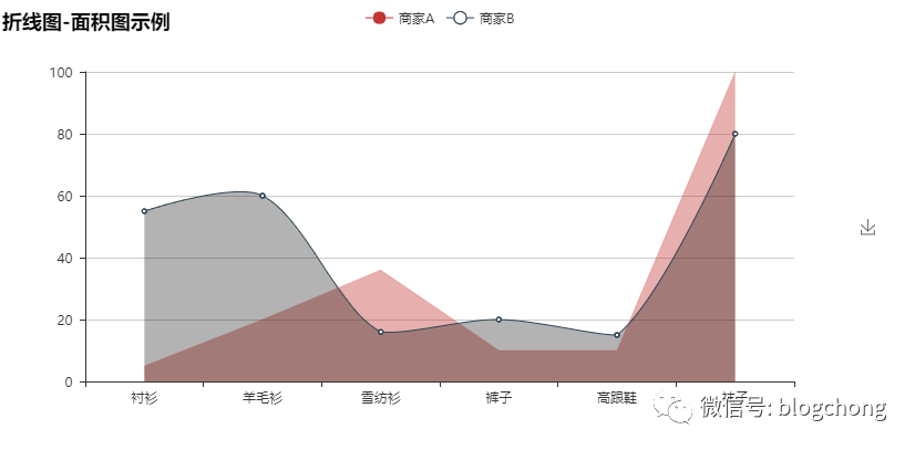
line =Line(“折线图-面积图示例”)line.add(“商家A”, attr, v1, is_fill=True, line_opacity=0.2, area_opacity=0.4, symbol=None)line.add(“商家B”, attr, v2, is_fill=True, area_color=‘#000’, area_opacity=0.3, is_smooth=True)line.show_config()line.render()
8 Liquid(水球图)
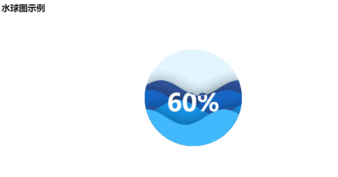
frompyecharts importLiquidliquid =Liquid(“水球图示例”)liquid.add(“Liquid”, [0.6])liquid.show_config()liquid.render()

frompyecharts importLiquidliquid =Liquid(“水球图示例”)liquid.add(“Liquid”, [0.6, 0.5, 0.4, 0.3], is_liquid_outline_show=False)liquid.show_config()liquid.render()
frompyecharts importLiquidliquid =Liquid(“水球图示例”)liquid.add(“Liquid”, [0.6, 0.5, 0.4, 0.3], is_liquid_animation=False, shape=‘diamond’)liquid.show_config()liquid.render()

9 Map(地图)
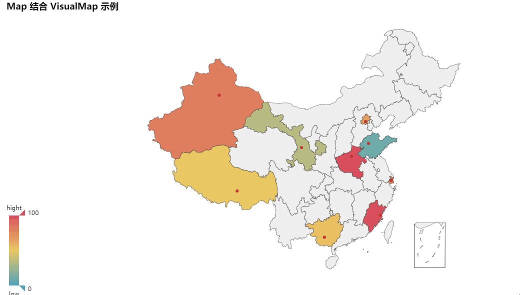
frompyecharts importMapvalue =[155, 10, 66, 78, 33, 80, 190, 53, 49.6]attr =[“福建”, “山东”, “北京”, “上海”, “甘肃”, “新疆”, “河南”, “广西”, “西藏”]map=Map(“Map 结合 VisualMap 示例”, width=1200, height=600)map.add(“”, attr, value, maptype=‘china’, is_visualmap=True, visual_text_color=‘#000’)map.show_config()map.render()
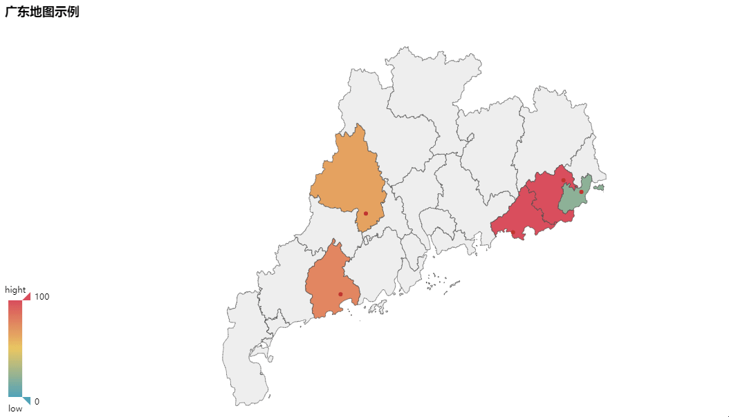
frompyecharts importMapvalue =[20, 190, 253, 77, 65]attr =[‘汕头市’, ‘汕尾市’, ‘揭阳市’, ‘阳江市’, ‘肇庆市’]map=Map(“广东地图示例”, width=1200, height=600)map.add(“”, attr, value, maptype=‘广东’, is_visualmap=True, visual_text_color=‘#000’)map.show_config()map.render()
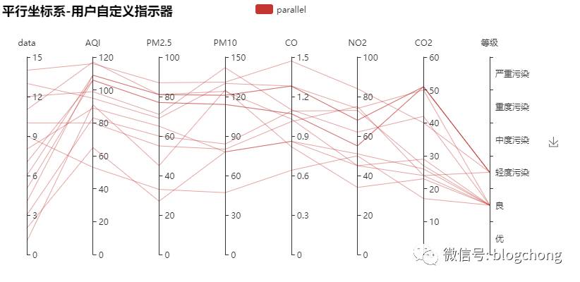
10 Parallel(平行坐标系)
frompyecharts importParallelc_schema =[ {“dim”: 0, “name”: “data”}, {“dim”: 1, “name”: “AQI”}, {“dim”: 2, “name”: “PM2.5”}, {“dim”: 3, “name”: “PM10”}, {“dim”: 4, “name”: “CO”}, {“dim”: 5, “name”: “NO2”}, {“dim”: 6, “name”: “CO2”}, {“dim”: 7, “name”: “等级”, “type”: “category”, “data”: [‘优’, ‘良’, ‘轻度污染’, ‘中度污染’, ‘重度污染’, ‘严重污染’]}]data =[ [1, 91, 45, 125, 0.82, 34, 23, “良”], [2, 65, 27, 78, 0.86, 45, 29, “良”], [3, 83, 60, 84, 1.09, 73, 27, “良”], [4, 109, 81, 121, 1.28, 68, 51, “轻度污染”], [5, 106, 77, 114, 1.07, 55, 51, “轻度污染”], [6, 109, 81, 121, 1.28, 68, 51, “轻度污染”], [7, 106, 77, 114, 1.07, 55, 51, “轻度污染”], [8, 89, 65, 78, 0.86, 51, 26, “良”], [9, 53, 33, 47, 0.64, 50, 17, “良”], [10, 80, 55, 80, 1.01, 75, 24, “良”], [11, 117, 81, 124, 1.03, 45, 24, “轻度污染”], [12, 99, 71, 142, 1.1, 62, 42, “良”], [13, 95, 69, 130, 1.28, 74, 50, “良”], [14, 116, 87, 131, 1.47, 84, 40, “轻度污染”]]parallel =Parallel(“平行坐标系-用户自定义指示器”)parallel.config(c_schema=c_schema)parallel.add(“parallel”, data)parallel.show_config()parallel.render()
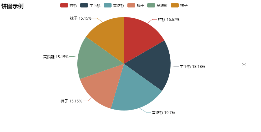
11 Pie(饼图)
frompyecharts importPieattr =[“衬衫”, “羊毛衫”, “雪纺衫”, “裤子”, “高跟鞋”, “袜子”]v1 =[11, 12, 13, 10, 10, 10]pie =Pie(“饼图示例”)pie.add(“”, attr, v1, is_label_show=True)pie.show_config()pie.render()
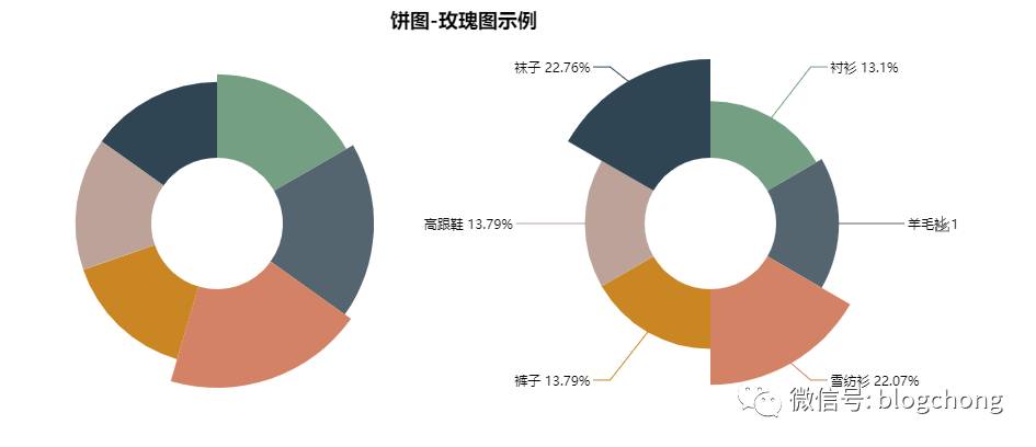
frompyecharts importPieattr =[“衬衫”, “羊毛衫”, “雪纺衫”, “裤子”, “高跟鞋”, “袜子”]v1 =[11, 12, 13, 10, 10, 10]v2 =[19, 21, 32, 20, 20, 33]pie =Pie(“饼图-玫瑰图示例”, title_pos=‘center’, width=900)pie.add(“商品A”, attr, v1, center=[25, 50], is_random=True, radius=[30, 75], rosetype=‘radius’)pie.add(“商品B”, attr, v2, center=[75, 50], is_random=True, radius=[30, 75], rosetype=‘area’, is_legend_show=False, is_label_show=True)pie.show_config() pie.render()
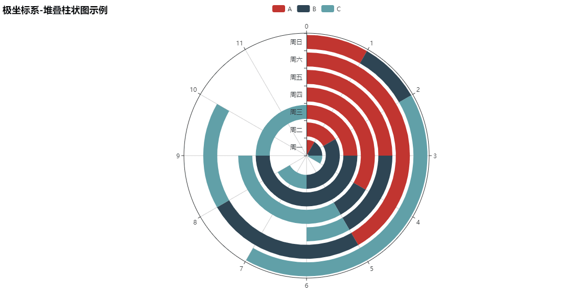
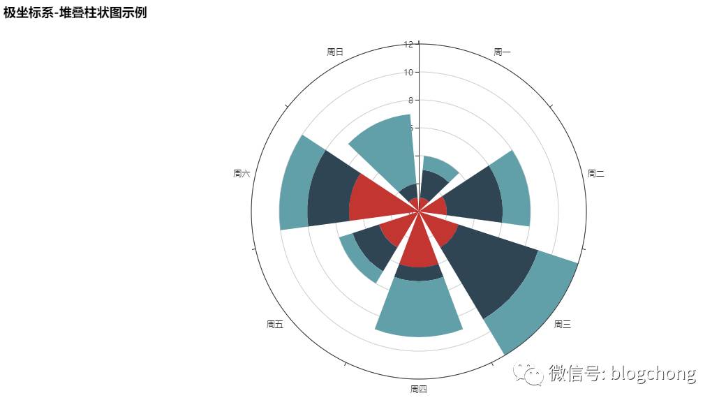
12 Polar(极坐标系)
frompyecharts importPolarradius =[‘周一’, ‘周二’, ‘周三’, ‘周四’, ‘周五’, ‘周六’, ‘周日’]polar =Polar(“极坐标系-堆叠柱状图示例”, width=1200, height=600)polar.add(“A”, [1, 2, 3, 4, 3, 5, 1], radius_data=radius, type=‘barRadius’, is_stack=True)polar.add(“B”, [2, 4, 6, 1, 2, 3, 1], radius_data=radius, type=‘barRadius’, is_stack=True)polar.add(“C”, [1, 2, 3, 4, 1, 2, 5], radius_data=radius, type=‘barRadius’, is_stack=True)polar.show_config()polar.render()
frompyecharts importPolarradius =[‘周一’, ‘周二’, ‘周三’, ‘周四’, ‘周五’, ‘周六’, ‘周日’]polar =Polar(“极坐标系-堆叠柱状图示例”, width=1200, height=600)polar.add(“”, [1, 2, 3, 4, 3, 5, 1], radius_data=radius, type=‘barAngle’, is_stack=True)polar.add(“”, [2, 4, 6, 1, 2, 3, 1], radius_data=radius, type=‘barAngle’, is_stack=True)polar.add(“”, [1, 2, 3, 4, 1, 2, 5], radius_data=radius, type=‘barAngle’, is_stack=True)polar.show_config()polar.render()
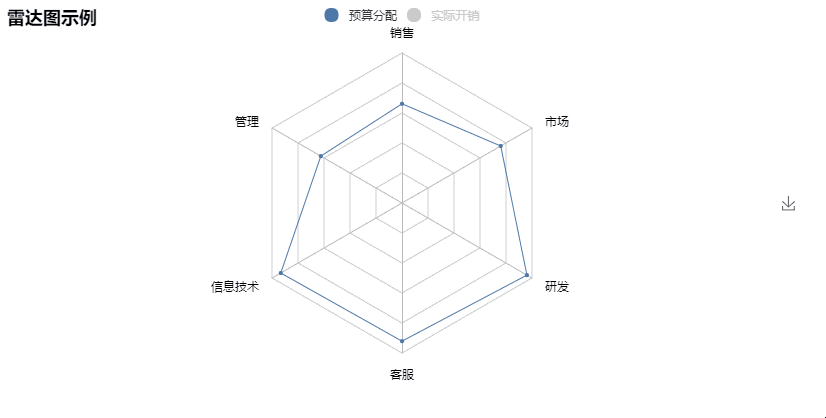
13 Radar(雷达图)
frompyecharts importRadarschema =[ (“销售”, 6500), (“管理”, 16000), (“信息技术”, 30000), (“客服”, 38000), (“研发”, 52000), (“市场”, 25000)]v1 =[[4300, 10000, 28000, 35000, 50000, 19000]]v2 =[[5000, 14000, 28000, 31000, 42000, 21000]]radar =Radar()radar.config(schema)radar.add(“预算分配”, v1, is_splitline=True, is_axisline_show=True)radar.add(“实际开销”, v2, label_color=[“#4e79a7”], is_area_show=False)radar.show_config()radar.render()
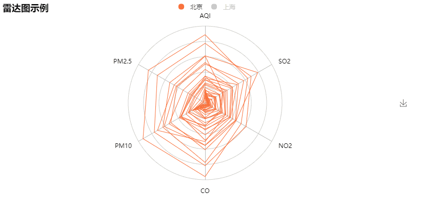
value_bj =[ [55, 9, 56, 0.46, 18, 6, 1], [25, 11, 21, 0.65, 34, 9, 2], [56, 7, 63, 0.3, 14, 5, 3], [33, 7, 29, 0.33, 16, 6, 4]…]value_sh =[ [91, 45, 125, 0.82, 34, 23, 1], [65, 27, 78, 0.86, 45, 29, 2], [83, 60, 84, 1.09, 73, 27, 3], [109, 81, 121, 1.28, 68, 51, 4]…]c_schema=[{“name”: “AQI”, “max”: 300, “min”: 5}, {“name”: “PM2.5”, “max”: 250, “min”: 20}, {“name”: “PM10”, “max”: 300, “min”: 5}, {“name”: “CO”, “max”: 5}, {“name”: “NO2”, “max”: 200}, {“name”: “SO2”, “max”: 100}]radar =Radar()radar.config(c_schema=c_schema, shape=‘circle’)radar.add(“北京”, value_bj, item_color=“#f9713c”, symbol=None)radar.add(“上海”, value_sh, item_color=“#b3e4a1”, symbol=None)radar.show_config()radar.render()
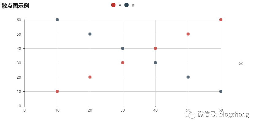
14 Scatter(散点图)
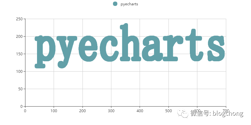
frompyecharts importScatterv1 =[10, 20, 30, 40, 50, 60]v2 =[10, 20, 30, 40, 50, 60]scatter =Scatter(“散点图示例”)scatter.add(“A”, v1, v2)scatter.add(“B”, v1[::-1], v2)scatter.show_config()scatter.render()
散点打印Pyecharts字体。
frompyecharts importScatterscatter =Scatter(“散点图示例”)v1, v2 =scatter.draw(“…/images/pyecharts-0.png”)scatter.add(“pyecharts”, v1, v2, is_random=True)scatter.show_config()scatter.render()
15 WordCloud(词云图)
frompyecharts importWordCloudname =[‘Sam S Club’, ‘Macys’, ‘Amy Schumer’, ‘Jurassic World’, ‘Charter Communications’, ‘Chick Fil A’, ‘Planet Fitness’, ‘Pitch Perfect’, ‘Express’, ‘Home’, ‘Johnny Depp’, ‘Lena Dunham’, ‘Lewis Hamilton’, ‘KXAN’, ‘Mary Ellen Mark’, ‘Farrah Abraham’, ‘Rita Ora’, ‘Serena Williams’, ‘NCAA baseball tournament’, ‘Point Break’]value =[10000, 6181, 4386, 4055, 2467, 2244, 1898, 1484, 1112, 965, 847, 582, 555, 550, 462, 366, 360, 282, 273, 265]wordcloud =WordCloud(width=1300, height=620)wordcloud.add(“”, name, value, word_size_range=[20, 100])wordcloud.show_config()wordcloud.render()

wordcloud =WordCloud(width=1300, height=620)wordcloud.add(“”, name, value, word_size_range=[30, 100], shape=‘diamond’)wordcloud.show_config()wordcloud.render()

五、用户自定义
用户还可以自定义结合 Line/Bar 图表
需使用 get_series() 和 custom() 方法
get_series()“”“获取图表的 series 数据 “””
custom(series)‘’‘追加自定义图表类型 ‘’’
-
series -> dict
追加图表类型的 series 数据
先用 get_series() 获取数据,再使用 custom() 将图表结合在一起
frompyecharts importBar, Lineattr =[‘A’, ‘B’, ‘C’, ‘D’, ‘E’, ‘F’]v1 =[10, 20, 30, 40, 50, 60]v2 =[15, 25, 35, 45, 55, 65]v3 =[38, 28, 58, 48, 78, 68]bar =Bar(“Line - Bar 示例”)bar.add(“bar”, attr, v1)line =Line()line.add(“line”, v2, v3)bar.custom(line.get_series())bar.show_config()bar.render()
六、更多示例
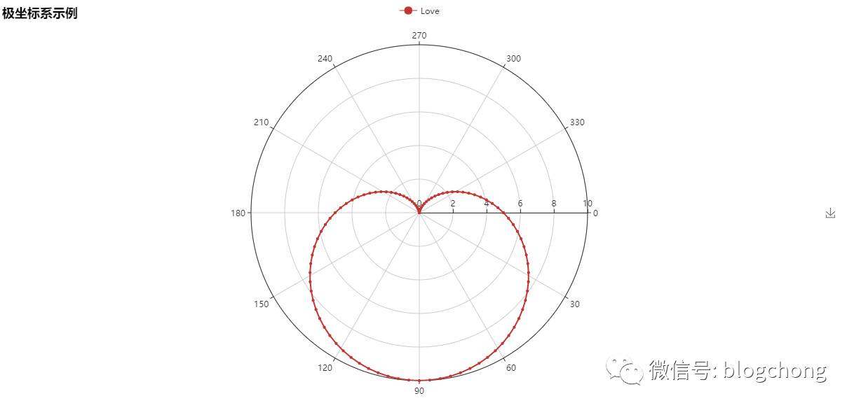
用极坐标系画出一个爱心
importmathfrompyecharts importPolardata =[]fori inrange(101): theta =i /100360r =5(1+math.sin(theta /180*math.pi)) data.append([r, theta])hour =[i fori inrange(1, 25)]polar =Polar(“极坐标系示例”, width=1200, height=600)polar.add(“Love”, data, angle_data=hour, boundary_gap=False,start_angle=0)polar.show_config()polar.render()
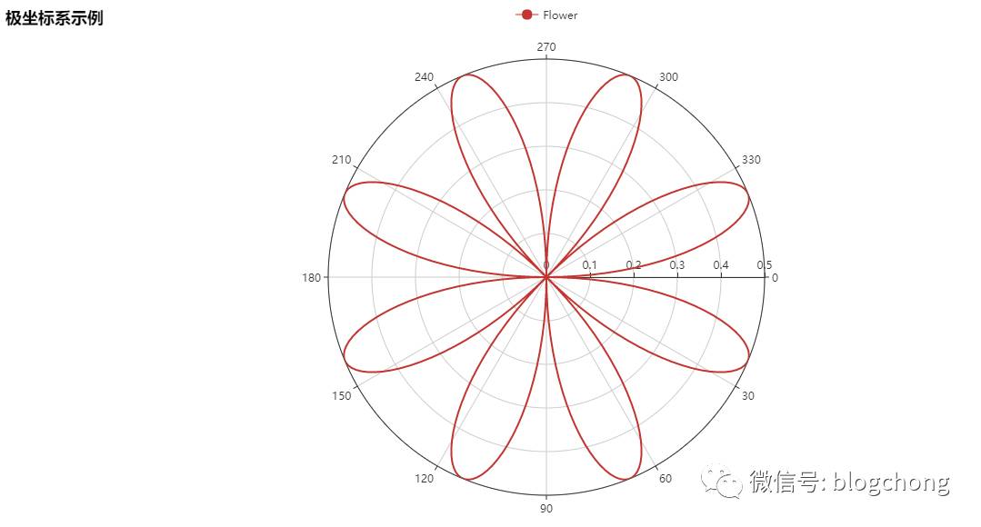
用极坐标系画出一朵小花
importmathfrompyecharts importPolardata =[]fori inrange(361): t =i /180math.pi r =math.sin(2t) math.cos(2t) data.append([r, i])polar =Polar(“极坐标系示例”, width=1200, height=600)polar.add(“Flower”, data, start_angle=0, symbol=None, axis_range=[0, None])polar.show_config()polar.render()
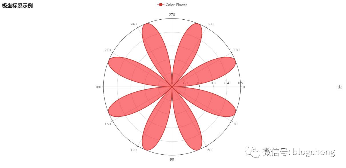
还可以给小花涂上颜色
importmathfrompyecharts importPolardata =[]fori inrange(361): t =i /180math.pi r =math.sin(2t) math.cos(2t) data.append([r, i])polar =Polar(“极坐标系示例”, width=1200, height=600)polar.add(“Color-Flower”, data, start_angle=0, symbol=None, axis_range=[0, None], area_color=“#f71f24”, area_opacity=0.6)polar.show_config()polar.render()
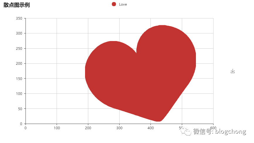
用散点图画出一个爱心
frompyecharts importScatterscatter =Scatter(“散点图示例”, width=800, height=480)v1 ,v2 =scatter.draw(“…/images/love.png”)scatter.add(“Love”, v1, v2)scatter.render()
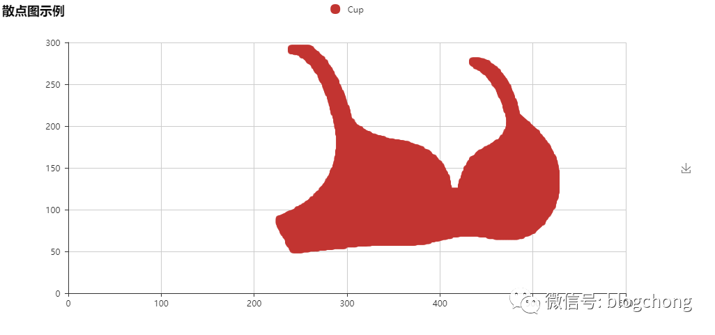
用散点图画出一个火辣的 Bra
frompyecharts importScatterscatter =Scatter(“散点图示例”, width=1000, height=480)v1 ,v2 =scatter.draw(“…/images/cup.png”)scatter.add(“Cup”, v1, v2)scatter.render()
某地最低温和最高气温折线图
frompyecharts importLineattr =[‘周一’, ‘周二’, ‘周三’, ‘周四’, ‘周五’, ‘周六’, ‘周日’, ]line =Line(“折线图示例”)line.add(“最高气温”, attr, [11, 11, 15, 13, 12, 13, 10], mark_point=[“max”, “min”], mark_line=[“average”])line.add(“最低气温”, attr, [1, -2, 2, 5, 3, 2, 0], mark_point=[“max”, “min”], mark_line=[“average”], yaxis_formatter=“°C”)line.show_config()line.render()
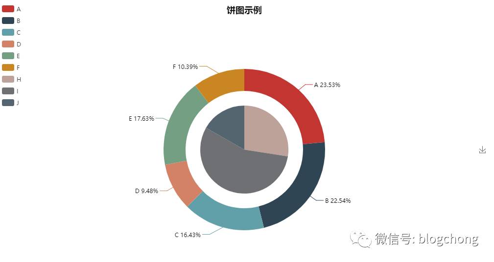
饼图嵌套
frompyecharts importPiepie =Pie(“饼图示例”, title_pos=‘center’, width=1000, height=600)pie.add(“”, [‘A’, ‘B’, ‘C’, ‘D’, ‘E’, ‘F’], [335, 321, 234, 135, 251, 148], radius=[40, 55],is_label_show=True)pie.add(“”, [‘H’, ‘I’, ‘J’], [335, 679, 204], radius=[0, 30], legend_orient=‘vertical’, legend_pos=‘left’)pie.show_config()pie.render()
饼图再嵌套
importrandomfrompyecharts importPieattr =[‘A’, ‘B’, ‘C’, ‘D’, ‘E’, ‘F’]pie =Pie(“饼图示例”, width=1000, height=600)pie.add(“”, attr, [random.randint(0, 100) for_ inrange(6)], radius=[50, 55], center=[25, 50],is_random=True)pie.add(“”, attr, [random.randint(20, 100) for_ inrange(6)], radius=[0, 45], center=[25, 50],rosetype=‘area’)pie.add(“”, attr, [random.randint(0, 100) for_ inrange(6)], radius=[50, 55], center=[65, 50],is_random=True)pie.add(“”, attr, [random.randint(20, 100) for_ inrange(6)], radius=[0, 45], center=[65, 50],rosetype=‘radius’)pie.show_config()pie.render()
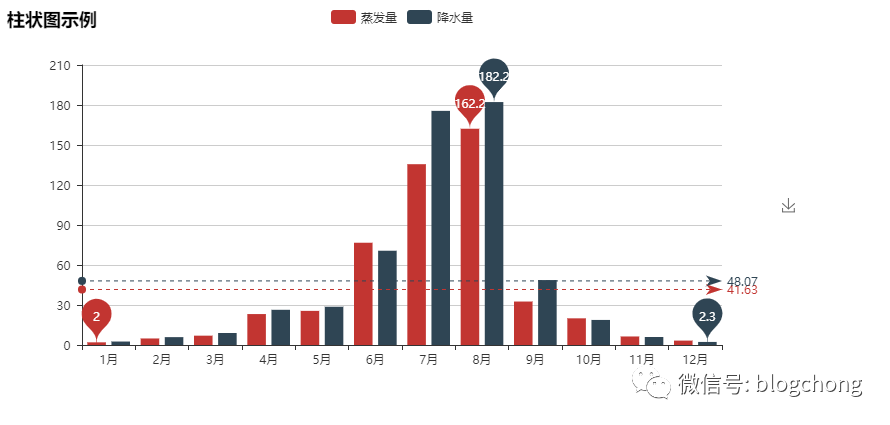
某地的降水量和蒸发量柱状图
frompyecharts importBarattr =[“{}月”.format(i) fori inrange(1, 13)]v1 =[2.0, 4.9, 7.0, 23.2, 25.6, 76.7, 135.6, 162.2, 32.6, 20.0, 6.4, 3.3]v2 =[2.6, 5.9, 9.0, 26.4, 28.7, 70.7, 175.6, 182.2, 48.7, 18.8, 6.0, 2.3]bar =Bar(“柱状图示例”)bar.add(“蒸发量”, attr, v1, mark_line=[“average”], mark_point=[“max”, “min”])bar.add(“降水量”, attr, v2, mark_line=[“average”], mark_point=[“max”, “min”])bar.show_config()bar.render()
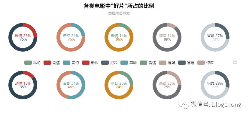
各类电影中"好片"所占的比例
frompyecharts importPiepie =Pie(‘各类电影中"好片"所占的比例’, “数据来着豆瓣”, title_pos=‘center’)pie.add(“”, [“剧情”, “”], [25, 75], center=[10, 30], radius=[18, 24], label_pos=‘center’, is_label_show=True, label_text_color=None, )pie.add(“”, [“奇幻”, “”], [24, 76], center=[30, 30], radius=[18, 24], label_pos=‘center’, is_label_show=True, label_text_color=None, legend_pos=‘left’)pie.add(“”, [“爱情”, “”], [14, 86], center=[50, 30], radius=[18, 24], label_pos=‘center’, is_label_show=True, label_text_color=None)pie.add(“”, [“惊悚”, “”], [11, 89], center=[70, 30], radius=[18, 24], label_pos=‘center’, is_label_show=True, label_text_color=None)pie.add(“”, [“冒险”, “”], [27, 73], center=[90, 30], radius=[18, 24], label_pos=‘center’, is_label_show=True, label_text_color=None)pie.add(“”, [“动作”, “”], [15, 85], center=[10, 70], radius=[18, 24], label_pos=‘center’, is_label_show=True, label_text_color=None)pie.add(“”, [“喜剧”, “”], [54, 46], center=[30, 70], radius=[18, 24], label_pos=‘center’, is_label_show=True, label_text_color=None)pie.add(“”, [“科幻”, “”], [26, 74], center=[50, 70], radius=[18, 24], label_pos=‘center’, is_label_show=True, label_text_color=None)pie.add(“”, [“悬疑”, “”], [25, 75], center=[70, 70], radius=[18, 24], label_pos=‘center’, is_label_show=True, label_text_color=None)pie.add(“”, [“犯罪”, “”], [28, 72], center=[90, 70], radius=[18, 24], label_pos=‘center’, is_label_show=True, label_text_color=None, is_legend_show=True, legend_top=“center”)pie.show_config()pie.render()
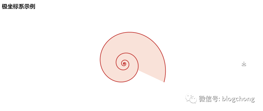
用极坐标系画出一个蜗牛壳
importmathfrompyecharts importPolardata =[]fori inrange(5): forj inrange(101): theta =j /100*360alpha =i 360+theta r =math.pow(math.e, 0.003alpha) data.append([r, theta])polar =Polar(“极坐标系示例”)polar.add(“”, data, symbol_size=0, symbol=‘circle’, start_angle=-25, is_radiusaxis_show=False, area_color=“#f3c5b3”, area_opacity=0.5, is_angleaxis_show=False)polar.show_config()polar.render()